Designing for the web in the browser
This is the second post of a multi-part series about developing the brand identity for Wismut Labs.
In the first part of this series, I covered the origins of Wismut Labs, as well as how our logo and colour scheme came about. This post will expand on that and also cover some of the design decisions for the website.
It all starts with content
When building for the web, it is important to understand that we do not design websites, we design content. Three years worth of agency work has taught me a lot of things, one of them is that designing anything with lorem ipsum in place of content is a recipe for rework when the real content comes in.
Ours is not a complicated website with tonnes of bells and whistles. We had already established a clear purpose of what we wanted the website to be, and the copy had to support that purpose. The website needed to answer a few questions:
- What can we do that adds value to potential clients?
- How do we prove we can do what we say?
- What is the first impression we want people to have about us?
The copy on the website needed to emphasise that fact that we come up with solutions relevant to each client’s unique context. There may be instances where two clients encounter very similar problems, but it is very rare that a single solution will work equally well for both.
Another important section of the website is the engineering blog. The blog is where people can get a better understanding of the way we think and work. It is only possible to explain something clearly if you understand it thoroughly. The ability to articulate our processes clearly benefits not only our clients, but ourselves as well.
Clothes make the man
A first impression is made based on looks, however superficial that may sound. And for a website, colours, fonts and layout play a big role in that first impression. It is analogous to the impression others have of you based on the clothes you’re wearing. I’ve already covered the choice of colour palette in the previous post and now I will move on to fonts.
Typography is story-telling. Fonts turn words into stories. So how do fonts influence us without us really knowing about it? They work a little bit like clothes. When we see them, they make a first impression …
— Sarah Hyndman
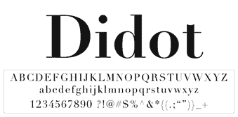
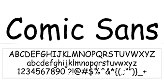
Every font has a personality and conveys a certain impression. If you see text typeset in Didot, the association is high fashion. In contrast, if the text is typeset in Comic Sans, most people tend to think casual and amateur.
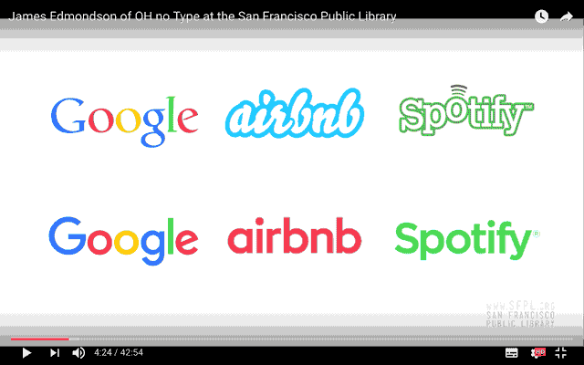
James Edmondson, founder of OH no Type Company, recently gave a talk at a Type@Cooper event, in which he highlighted how the last few years have given way to a resurgence in the popularity of the geometric sans, particularly in identity work for tech companies.
A geometric sans serif is a typeface whose letters are constructed from basic shapes of circles, squares and triangles, with uniform strokes of barely any contrast. Such typefaces look very clean, almost mechanical, and are considered rather modern, given they first came about in the mid-1920s. The appeal of such an aesthetic to tech companies is understandable.
For Wismut Labs, however, I wanted to stress the human element in cutting edge technology. Our goal is not to replace human beings from industry, but rather, augment human capabilities. I also agree with James Edmondson’s opinion that a homogeneous design culture is not a good thing. And hence our choice of typefaces leaned toward humanist styles, meaning the letters have a hint of handwriting to them.
Bree Serif, created by independent type foundry TypeTogether, is a strong slab serif with quite a charming personality, from its cursive ‘e’s to its rhythmic ‘k’s and ‘y’s, perfect for headings and larger text.
Source Sans Pro is a humanist sans-serif designed by Paul D. Hunt out of Adobe, and is designed to be comfortable to read in longer passages. It has distinct differentiations for characters that are commonly confused, namely the number ‘1’, the lowercase ‘l’ and the uppercase ‘I’.
One thing that you don’t see often on websites for tech companies is the use of patterns and textures. Perhaps the prevailing trend is that clean, minimal aesthetic, you know, with full bleed hero images, loads of white space and use of icons, always lots of icons, plus some animations thrown in for good measure.
But the use of patterns can enhance the design of a website by adding visual interest. Solid colours are great, but for longer pages split up into multiple sections, repeating solid colours may sometimes look a bit boring. This design utilises a few subtle background patterns to break up the monotony.


You can’t build a sandcastle underwater
Every category of designer has a specific medium they work with. Web designers work with the browser. The browser is a young and unique medium. Young because the first browser was invented in 1990, and unique because designers cannot control how their work is viewed by their audience.
It doesn’t really make sense to design for a dynamic medium like the browser with a static tool like Photoshop. This is not to say there is no use for applications like Photoshop or Sketch. Those are still useful for establishing the look and feel of the website, and for planning and testing out ideas.
I belong to the camp of web designers who prefer designing in the browser, because of the dynamic nature of the rendered end product. When designers use Photoshop or Sketch, the final output is the result of their direct manipulation of elements on the canvas. We cannot do that on the web. Our ideal visual designs need to be translated into code the browser can parse and render, and that requires a thorough understanding of how the browser works.
In addition, there are multiple browser engines powering the web, each with slightly different support for the multitude of HTML, CSS and Javascript properties. Often, cross-browser support can be a headache for web designers and developers, but this can also be an opportunity for creativity.
Designing in the browser may not work for everyone. It does require a reasonably in-depth understanding of the different browser rendering engines, and relatively up-to-date knowledge about the state of browser support, especially with regards to the newer properties. But experience does help, and developing familiarity with the browser is an investment that pays off in due time.
Wrapping up
The next part in the series will cover the development process of building the website for cross-browser compatibility, as well as the tools and techniques that can help speed up the process.
Read Part 1: What’s in a name? Behind the branding of Wismut Labs
Read Part 3: Building for cross-browser compatibility